Best Image Sizes for Websites: Header, Blog & Thumbnail Guide
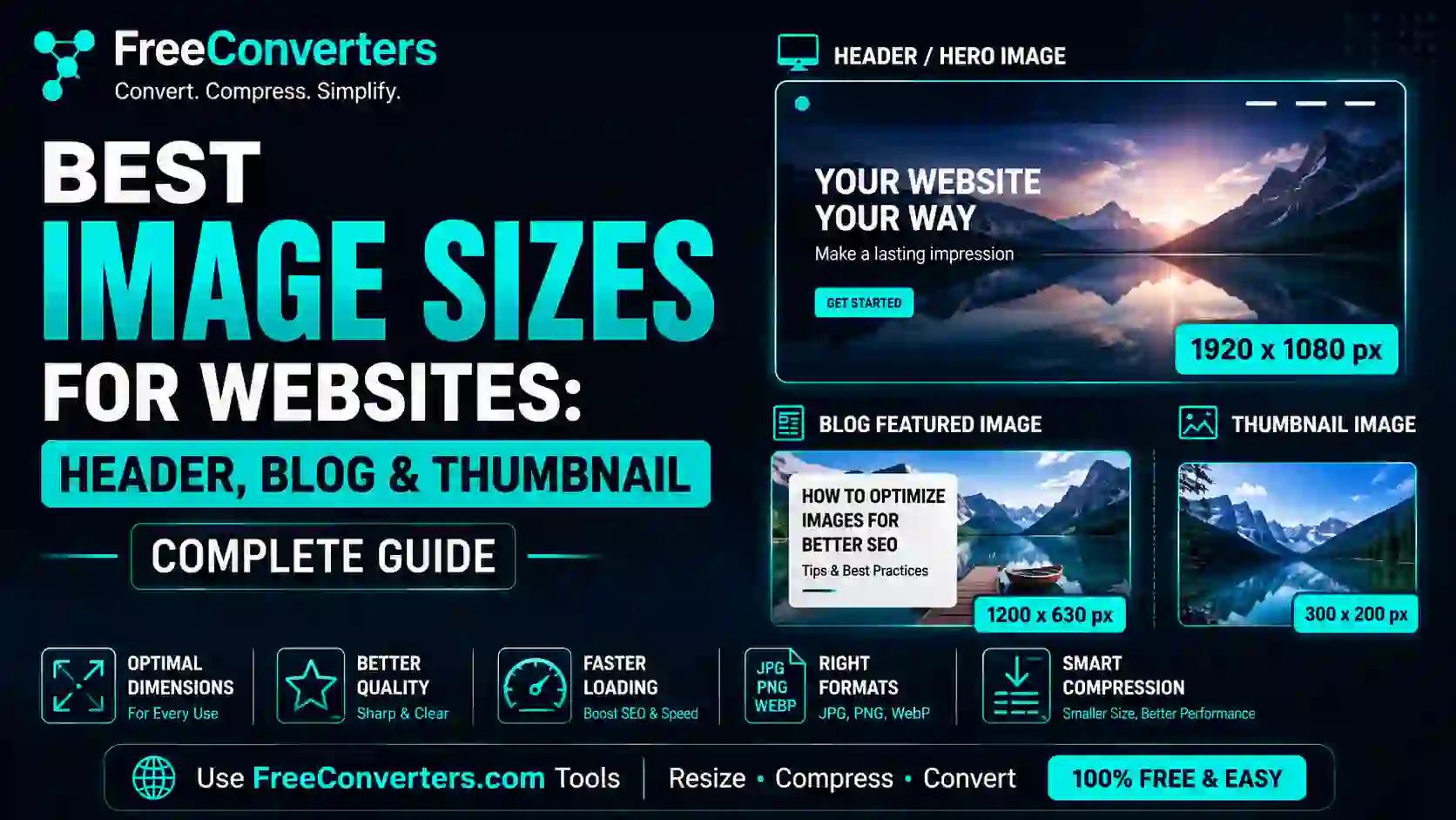
The best image size depends on where the image lives: website headers typically run 1920×600 to 1920×1080 pixels, blog featured images work best at 1200×630 pixels, and thumbnails usually sit around 300×200 to 400×300 pixels. Getting these dimensions right — and pairing them with proper compression — is what separates a fast, professional-looking website from one that drags on mobile and looks stretched on desktop.
Most site owners either oversize their images out of caution or undersize them trying to save load time, and both mistakes cost something: slow pages hurt Core Web Vitals and rankings, while undersized images look blurry on modern retina screens. This guide breaks down the exact pixel dimensions for every major use case, explains why they matter, and shows you how to resize and compress images correctly using a free tool — no design software required.
What Counts as a "Header," "Blog Image," and "Thumbnail"?
These three terms get used loosely, so it's worth being precise before jumping into numbers.
A header image (sometimes called a hero image) is the large visual banner at the top of a webpage — usually full-width, sitting above the main content and often behind a headline or call-to-action. It's the first thing a visitor sees, which makes it one of the most important images on the page for both design and performance.
A blog featured image is the representative image attached to a blog post. It shows up in blog listing pages, RSS feeds, and — critically — in social media link previews when someone shares the post on Facebook, LinkedIn, or Twitter/X.
A thumbnail is a small preview image, typically used in grids, related-post widgets, search results, or category pages. Thumbnails prioritize fast loading over detail, since dozens might load on a single page.
Understanding which category an image falls into is the first step, because the "correct" size genuinely differs across all three — using one blanket size for everything is one of the most common mistakes site owners make.
Best Image Size for Website Headers
Header images need to strike a balance between visual impact and file weight, since they load above the fold and directly affect a metric called Largest Contentful Paint (LCP) — one of Google's three Core Web Vitals.
Recommended dimensions:
- Full-width hero image: 1920×1080 pixels (16:9 ratio) — the standard for most modern desktop screens
- Shorter header/banner strip: 1920×600 or 1920×500 pixels — common on SaaS and business sites where the header doesn't need to fill the entire viewport
- Mobile-optimized version: 828×1200 pixels or a separate cropped asset served via responsive srcset
Here's the part many WordPress and Shopify tutorials skip: you should almost never serve the same header image file to desktop and mobile users. A 1920px-wide image scaled down by CSS on a phone screen still forces that phone to download the full file, which wastes bandwidth and directly hurts your mobile page speed score. Using the HTML srcset attribute (or your CMS's responsive image feature) lets the browser choose an appropriately sized file based on the visitor's screen width.
If you're building a header for a landing page specifically, keep text and key visual elements centered within the middle 60% of the frame — different screen widths crop the sides differently, and content near the edges can get cut off on ultra-wide or narrow displays.
Best Image Size for Blog Featured Images
Blog featured images do double duty: they display within your site's blog layout, and they become the preview image when your post gets shared on social media through Open Graph metadata.
Recommended dimensions: 1200×630 pixels (roughly 1.91:1 aspect ratio).
This specific size isn't arbitrary — it's the dimension recommended by Facebook's Open Graph specification and it's also compatible with how Twitter/X and LinkedIn render link previews. Using 1200×630 means one single image file works correctly across your blog layout and every major social platform, so you're not creating separate crops for each destination.
A few practical notes that matter here:
- Keep essential text or faces away from the outer 10% of the frame, since some platforms crop the edges slightly differently.
- File size should stay under 1MB ideally, and under 5MB as a hard ceiling — most platforms will refuse to generate a preview for anything heavier.
- If your CMS auto-generates a smaller crop for your blog listing page from this same 1200×630 master file, you generally don't need a second version.
WordPress users specifically should note that the "featured image" setting pulls double duty as both the blog thumbnail and, if no separate Open Graph image is set, the social share image too — so getting this one dimension right covers most of your bases.
Best Image Size for Thumbnails
Thumbnails are the images most people over-engineer or completely neglect. Because they appear in bulk — think a blog archive page showing twenty post previews at once — their combined weight matters enormously for page load speed.
Recommended dimensions:
- Blog listing thumbnail: 300×200 to 400×300 pixels
- Related posts widget thumbnail: 150×150 to 250×150 pixels
- E-commerce category grid thumbnail: 300×300 pixels (square, for consistent grid alignment)
- YouTube-style video thumbnail: 1280×720 pixels (this one's an exception — YouTube requires a much larger source file even though it displays small, so it renders sharp when a user clicks to full screen)
The instinct to make thumbnails as small as possible in dimension terms is generally right, but there's a catch: on a retina or high-DPI screen, a genuinely 300×200 pixel image will look visibly soft. This is covered in more depth in the next section, but the short version is that most thumbnails should actually be exported at 2x their display size and then compressed well, rather than exported at exactly their display size.
Image Size by Platform and CMS
WordPress (standard theme)
Header/Hero Size: 1920×600–1080
Featured/Blog Image: 1200×630
Thumbnail: 300×200
Shopify
Header/Hero Size: 1920×1080 (banner)
Featured/Blog Image: 1200×628
Thumbnail: 360×360
Medium
Header/Hero Size: 1500×750
Featured/Blog Image: 1500×750 (same file)
Thumbnail: Auto-generated
Squarespace
Header/Hero Size: 2500×1500 (recommends larger source)
Featured/Blog Image: 1200×630
Thumbnail: Auto-cropped
Wix
Header/Hero Size: 1920×600
Featured/Blog Image: 1200×630
Thumbnail: Auto-generated
Custom-built (Next.js/React sites)
Header/Hero Size: 1920×1080, served via srcset
Featured/Blog Image: 1200×630
Thumbnail: 400×300, lazy-loaded
Squarespace is worth calling out specifically since it recommends uploading larger source images than it actually displays, because its templates apply automatic cropping and zoom effects that need extra pixel data to avoid looking pixelated. WordPress, by contrast, generates multiple resized copies automatically from whatever you upload, but it can't fix a source image that was too small to begin with — it can only shrink, not enlarge, without quality loss.
Retina Displays and High-DPI Screens: The Size Most People Miss
This is genuinely the detail that separates a website that looks professionally designed from one that looks slightly "off" without anyone quite knowing why.
Modern devices — most iPhones since 2012, most MacBooks, and a large share of Android phones and Windows laptops — use high-density displays that pack more physical pixels into the same screen space. A "retina" display commonly runs at 2x pixel density, meaning it has four times as many actual pixels as a standard display of the same physical size.
Here's what that means practically: if your header image is uploaded at exactly 1920×1080 pixels and your CSS displays it at 1920px wide, it will look perfectly sharp on a standard monitor — but soft and slightly blurry on a retina MacBook, because the browser has to stretch each of your pixels across four physical pixels on the screen.
The fix is straightforward: export your image at 2x the dimensions you actually need it to display at, then compress it properly. A header that displays at 1920×1080 should ideally be sourced from a 3840×2160 original, resized down to 1920×1080 for standard use, with a 2x variant served to high-DPI screens via srcset or your CMS's automatic responsive image handling.
This is also exactly why upscaling a small image rarely looks good — you can't manufacture the extra pixel density retina screens need from a source image that never had it. Starting with a high-resolution original and resizing down, rather than starting small and trying to scale up, is the only reliable path to sharpness across every device type.
Aspect Ratio: Why It Matters as Much as Pixel Dimensions
Pixel dimensions tell you the size, but aspect ratio tells you the shape — and getting this wrong is what causes stretched, squashed, or awkwardly cropped images even when the file dimensions are "correct" on paper.
The most common aspect ratios in web design:
- 16:9 — the standard widescreen ratio, used for most modern header images and video thumbnails
- 1.91:1 — the Open Graph standard for blog featured images and social share cards
- 1:1 (square) — common for e-commerce thumbnails, profile images, and Instagram-style grids
- 4:3 — an older standard, less common now but still used in some product photography contexts
If your CMS's template expects a 16:9 header but you upload an image cropped at 4:3, the system will either stretch it (distorting faces and objects), crop it unpredictably (potentially cutting off important content), or letterbox it with empty space on the sides. None of these outcomes look intentional. Cropping your source image to the correct aspect ratio before upload, rather than relying on your CMS to guess how to handle a mismatched ratio, gives you control over exactly what gets shown.
Image Size vs. Loading Speed: The Trade-Off Nobody Can Fully Avoid
There's a real tension between visual quality and page speed, and no image size guide is honest if it pretends this trade-off doesn't exist. Larger, sharper images look better but take longer to load; smaller, more compressed images load fast but can look noticeably softer on close inspection.
The good news is that dimension and file size are two separate levers, and you don't have to sacrifice one to fix the other. A 1920×1080 header image can weigh anywhere from 200KB to 4MB depending purely on compression settings and file format — same pixel dimensions, wildly different load times.
Practical targets worth aiming for:
- Header/hero images: Under 300KB after compression, ideally in WebP format
- Blog featured images: Under 150KB
- Thumbnails: Under 50KB each, since multiple load simultaneously on listing pages
According to Google's web.dev documentation on optimizing LCP, the largest visible element on a page — which is very often the header image — should finish rendering within 2.5 seconds for a "good" Core Web Vitals score. Oversized, uncompressed header images are one of the most common reasons sites fail this benchmark.
This is where resizing and compressing work as a team rather than as competing priorities. Resize your image to the actual pixel dimensions it needs (not larger "just in case"), then run it through a dedicated image compressor to strip out unnecessary data at that size. Doing both steps, in that order, consistently produces the smallest possible file at acceptable visual quality — doing only one rarely gets you there. For a deeper look at exactly how compression affects visible quality, this breakdown of image compression and quality trade-offs walks through the mechanics in more detail.
Choosing the Right File Format for Each Image Type
Dimensions matter, but format choice affects both quality and file size just as much.
WebP is the best default for header images, blog thumbnails, and most photographic content on modern websites. It typically produces files 25–35% smaller than an equivalent-quality JPG, and it supports both lossy and lossless modes plus transparency. Browser support is now near-universal, covering Chrome, Firefox, Safari, and Edge.
JPG/JPEG remains a safe fallback for photographs, especially if you need maximum compatibility with older systems, email clients, or third-party tools that don't fully support WebP yet.
PNG is the right call for images with sharp edges, text overlays, or transparency needs — logos in a header, icon-based thumbnails, or graphics with flat color areas. PNG is lossless, which keeps text crisp, but produces larger files than JPG or WebP for photographic content, so it's not ideal for full hero photography.
SVG deserves a mention for anything that isn't a photograph — logos, icons, and simple illustrations scale infinitely without any quality loss at all, since they're vector-based rather than pixel-based, and they're often smaller than even a well-compressed PNG for simple graphics.
If you're regularly converting between formats to match these use cases, the Free Convertors image converter handles JPG, PNG, and WebP conversions in one place, and the dedicated WebP to JPG tool is useful when a platform you're uploading to doesn't yet accept WebP files. For a fuller comparison of when each format actually wins, see this breakdown of PNG vs. JPG vs. WebP.
How to Resize and Optimize Images for Your Website (Step-by-Step)
Here's the practical workflow for getting any image — header, blog featured image, or thumbnail — to the correct size without losing sharpness.
- Start with the highest-resolution original you have. Never try to enlarge a small image to hit a target size; quality only degrades from there. If you're working from a smartphone photo or stock image, keep the largest exported version until the final step.
- Crop to the correct aspect ratio first. Before resizing dimensions, crop the image to match the shape you need (16:9 for headers, 1.91:1 for blog featured images, 1:1 for square thumbnails). This prevents distortion later.
- Resize to 2x your target display size if the image will appear on retina screens (which, realistically, is most visitors today). Use the Free Convertors Image Resizer to set exact pixel dimensions with aspect ratio locked, keeping the image sharp through the resize.
- Compress the resized image. Run the resized file through the image compressor to strip unnecessary data while keeping visual quality intact. This step alone often cuts file size by 60–80% with no visible difference.
- Convert to WebP if your platform supports it, using the image converter, for the smallest final file size.
- Preview at actual size before publishing. Check how the image renders on both a standard and a retina display if possible — thumbnail previews in your CMS's media library often hide quality issues that become visible once the image is live on the page.
For bulk work, like resizing an entire batch of blog thumbnails at once, batch processing saves considerable time over handling files one by one — most tools that support multi-file upload will apply the same target dimensions across the whole set in a single pass.
Common Mistakes That Hurt Both Speed and Quality
- Uploading camera-original files directly. A modern smartphone photo can easily be 4000×3000 pixels and 8MB — dramatically oversized for a header that displays at 1920×1080. Uploading it unresized forces the browser to download the full file and scale it down client-side, wasting bandwidth for no visual benefit.
- Using the same image file across every screen size. Without responsive srcset handling, mobile visitors download the same heavy desktop-sized header image, which disproportionately hurts mobile page speed scores.
- Ignoring Open Graph dimensions for blog posts. Publishing a blog post with an incorrectly sized or missing featured image often results in a broken or oddly cropped preview when the post gets shared on social media — a lost opportunity for click-through traffic.
- Compressing before resizing. Compression artifacts get magnified when an already-compressed image is subsequently resized. Always resize to final dimensions first, then apply compression as the last step.
- Treating all thumbnails as equally low-priority. A blog listing page with twenty poorly optimized 500KB thumbnails can weigh more than the entire rest of the page combined — thumbnails add up fast in aggregate even though each one looks small individually.
Frequently Asked Questions
What is the best image size for a website header? Most website headers work best at 1920×1080 pixels for full-height hero sections, or 1920×600 pixels for a shorter banner-style header. Export at 2x these dimensions if you want sharp rendering on retina displays.
What size should a blog featured image be? 1200×630 pixels is the standard recommendation, since it matches Facebook's and other platforms' Open Graph specification for social share previews while also working well within most blog layouts.
Does image size affect website loading speed? Yes, significantly. Both pixel dimensions and file size (in KB/MB) affect load time — an oversized image, even a well-compressed one, still takes longer to download and render than a correctly sized one, particularly on mobile connections.
What is the ideal aspect ratio for a hero image? 16:9 is the most common and versatile choice for header and hero images, matching most modern screen proportions without requiring heavy cropping across devices.
What image size is best for Open Graph sharing? 1200×630 pixels, saved under 5MB (ideally under 1MB), is the widely accepted standard that renders correctly across Facebook, LinkedIn, and Twitter/X link previews.
How do I optimize header images for mobile without losing quality? Use responsive srcset markup to serve a smaller, appropriately sized image file to mobile screens rather than scaling down a desktop-sized image with CSS. Resize a dedicated mobile version — typically under 1000px wide — and compress it separately.
Final Takeaway
Getting image sizing right for headers, blog posts, and thumbnails isn't about memorizing one universal number — it's about matching pixel dimensions and aspect ratio to where the image actually appears, accounting for retina screens, and compressing properly so quality and speed aren't fighting each other. The specific numbers in this guide (1920×1080 for headers, 1200×630 for blog images, 300×200 for thumbnails) cover the vast majority of real-world use cases across WordPress, Shopify, and custom-built sites.
The workflow that consistently works: start with a high-resolution original, crop to the right aspect ratio, resize to the correct dimensions, then compress and convert to WebP. Try running your next header or blog image through the Free Convertors Image Resizer and Image Compressor to see the size and speed difference firsthand — both are free, browser-based, and don't require an account. For everything else in your image workflow, the full tools collection covers conversion, compression, and resizing in one place.